Streamlining event registration for older members
CFR utilizes an online portal for members to interact with global influencers, noted thinkers, and experienced practitioners. This online portal manages the member-only programming where individuals can register to various events and come together to engage in nonpartisan conversation. In this project, we revamped the user experience and redesigned the UI with the newly implemented design language.
Timeline
4 months
Team
1 PM, 2 engineers, many stakeholders
Role
Lead Designer
Methods
User Personas, User Journey Map, User Flows, Visual Design, Prototyping
-
Business: Gap in the number of registrations and attendees
User: Lack of clear registration paths
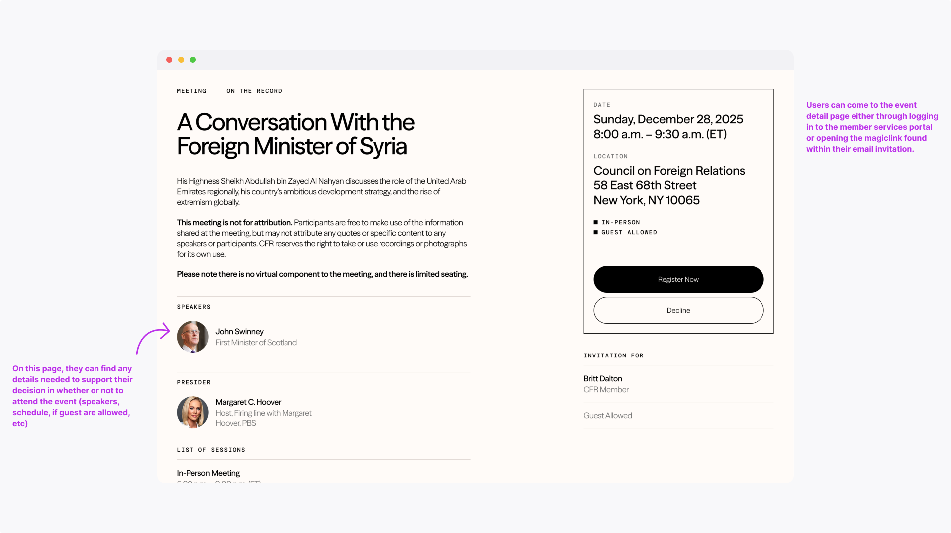
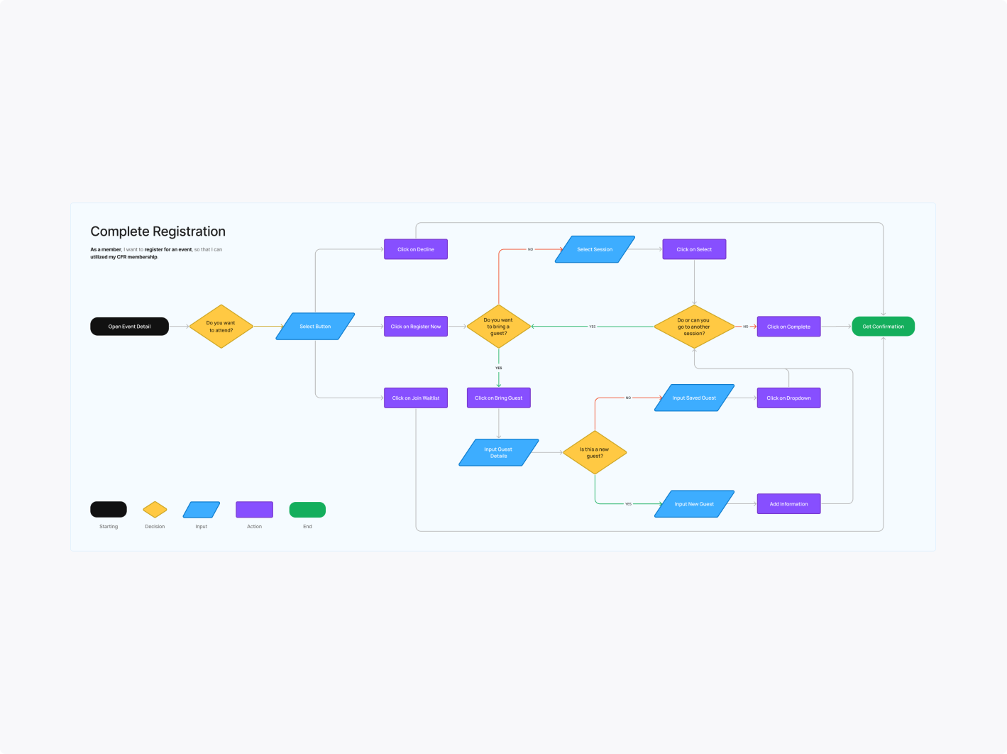
Defining the problem: How might we provide clarity to members who are considering attending an event?
-
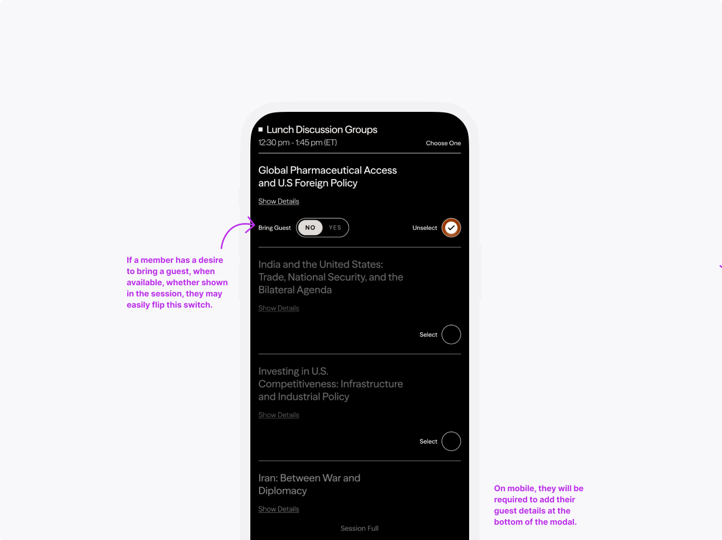
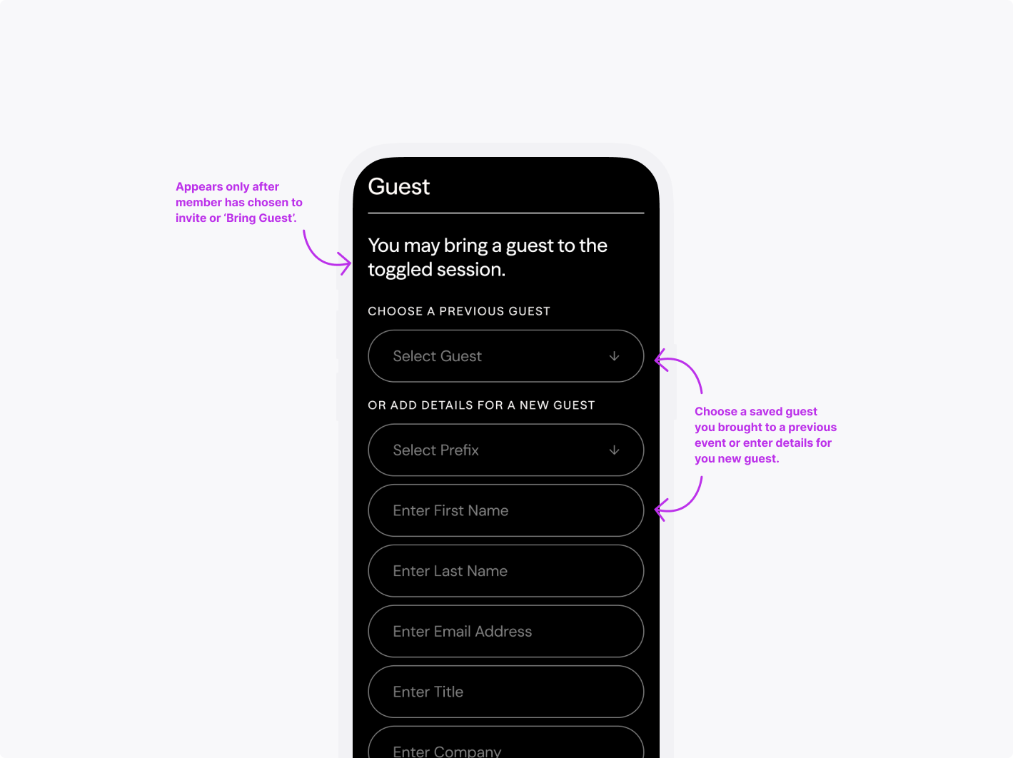
Update magiclinks with relevant details (i.e., registered sessions, sessions where the guest is included, etc)
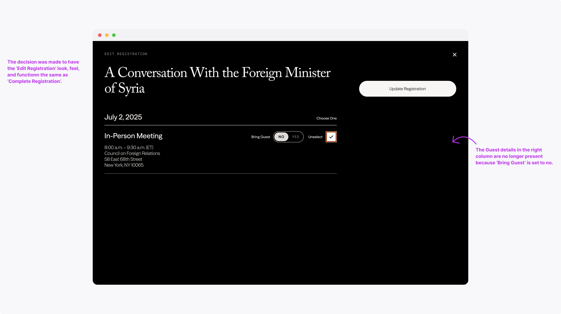
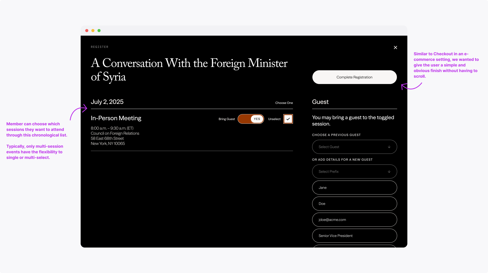
Streamline registration workflows to shorten the time of task completion
Create a convenient experience that drives members to connect more
-
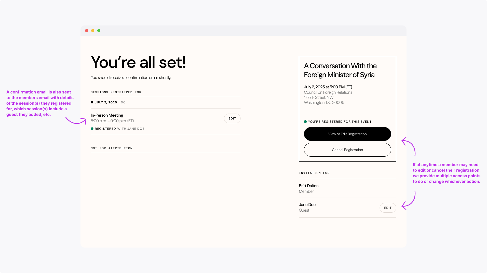
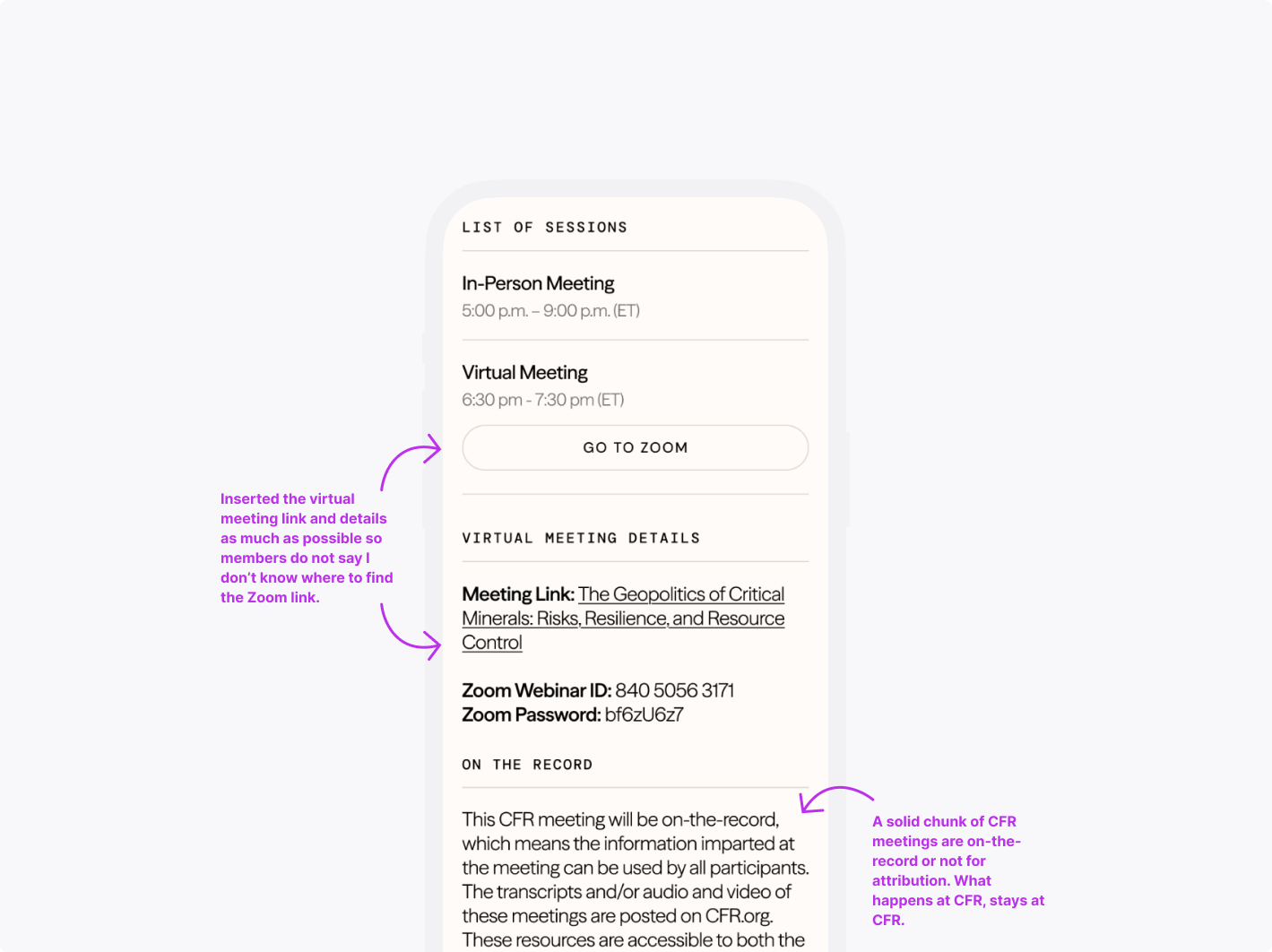
Decrease the number of members reaching out to the Events team
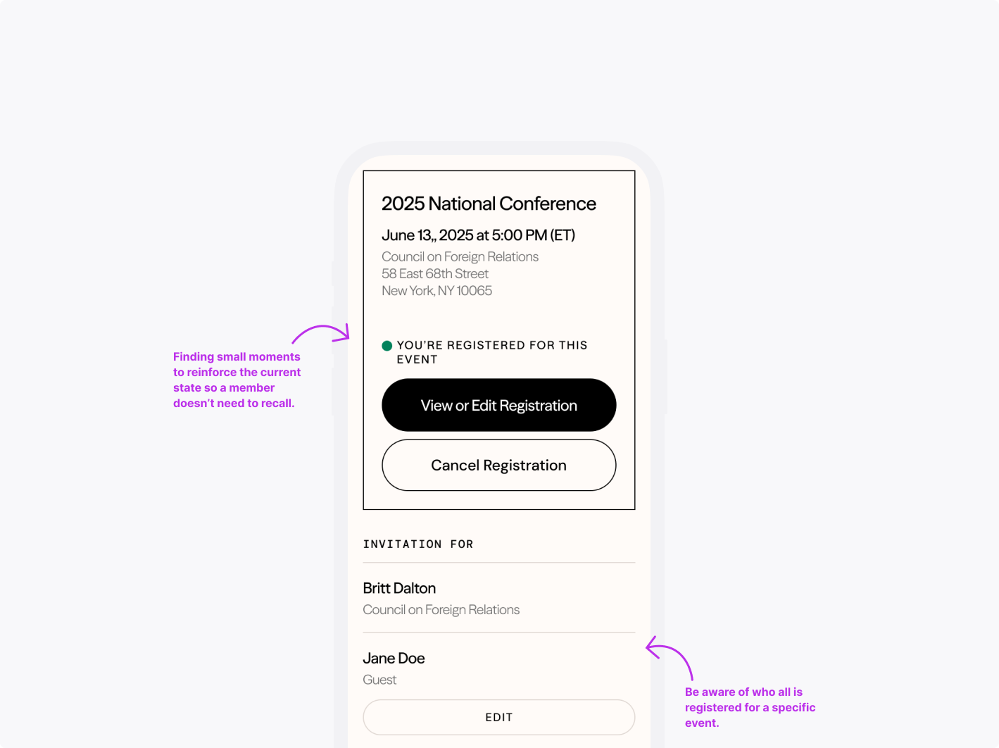
Members typically ask the Events team questions ranging from whether they’re registered for the event to where the Zoom link to the eventReduce abandonment rates while completing or updating registration
Received frequent feedback that I can’t see what I’m registered for or forgot to complete because it’s too long a formStrengthen the value proposition of CFR membership
Meeting the moment to serve our valued members, to create touch points, and to drive a significant chunk of CFR’s fundingxt goes here
-
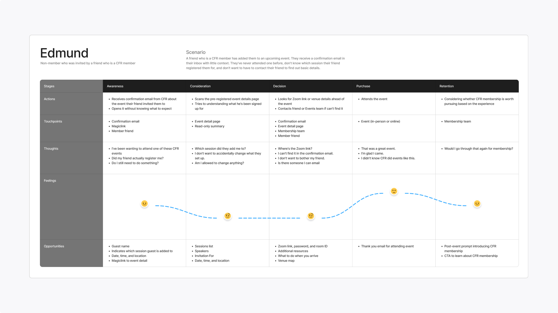
Guests
Seeks convenience—values the opportunity and is considering becoming a memberJTBD: When I want to verify which session my friend added me to, I don’t want to have to contact them to find out those details.
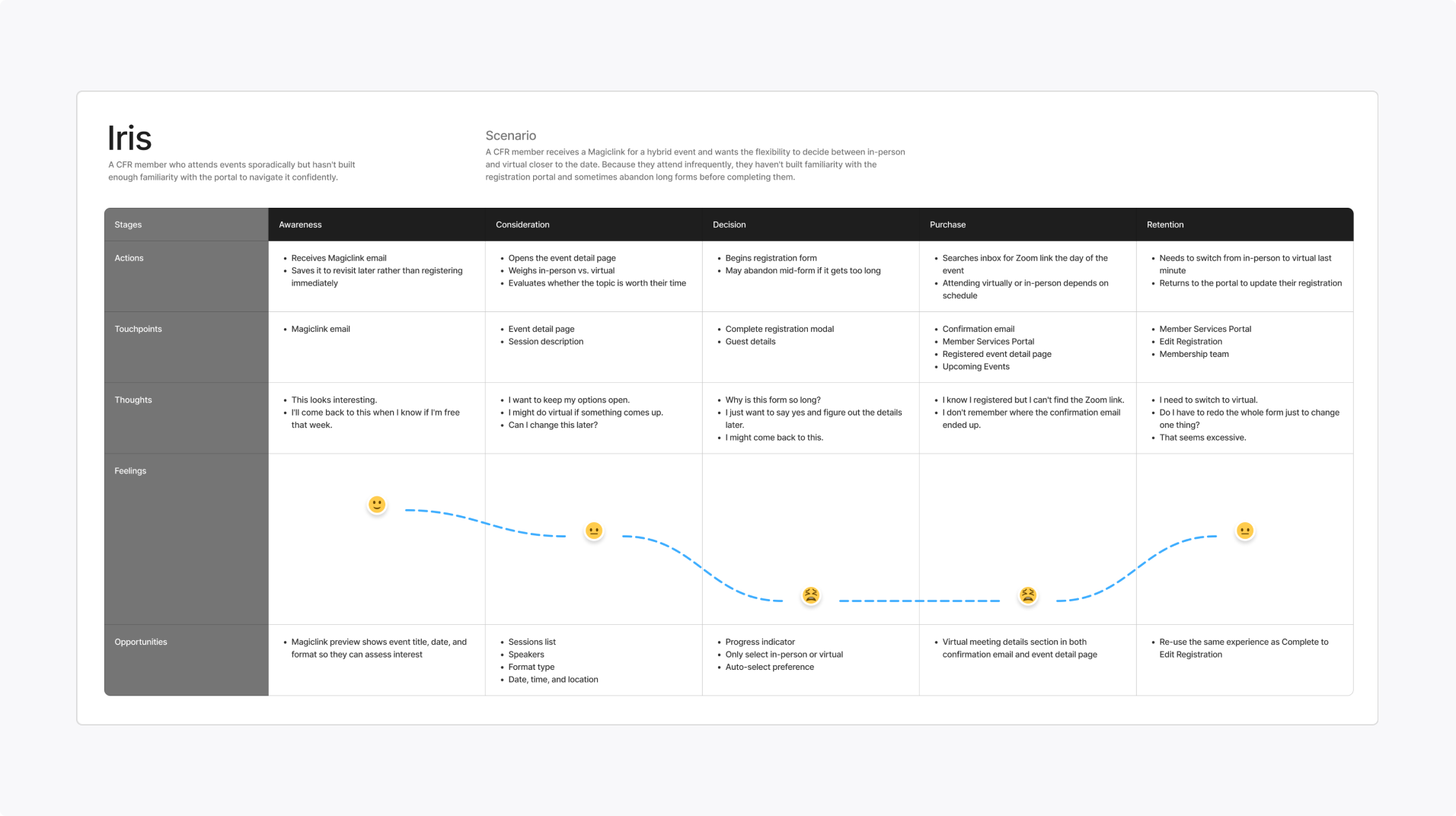
Casual attendees
Seeks flexibility—which makes it harder for her/him to build familiarityJTBD: When I sign up for a hybrid event, make finding the Zoom link easily accessible in case I decide to skip the in-person session.
Avid attendees
Seeks conciseness—she/he understands the routine and what to expectJTBD: When I need to make a last-second change, I want to focus on updating that specific item rather than the entire reservation.
Further Context
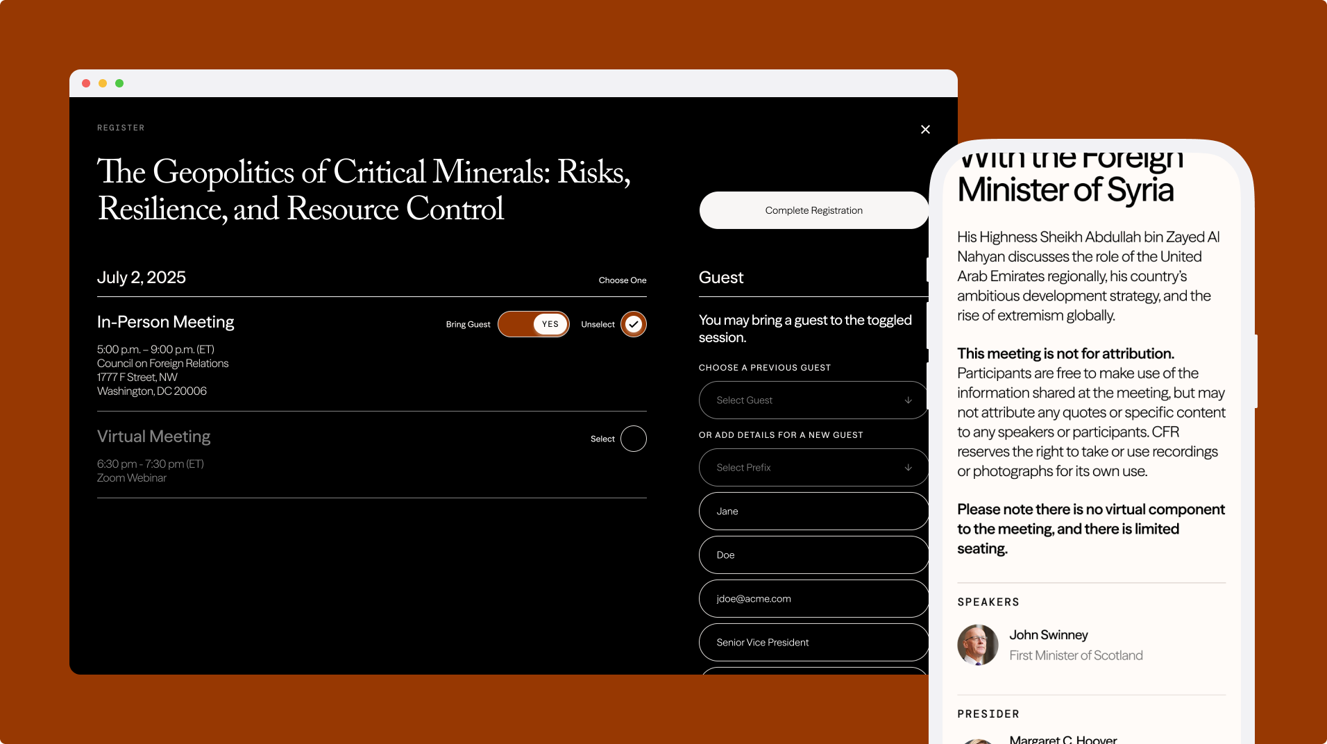
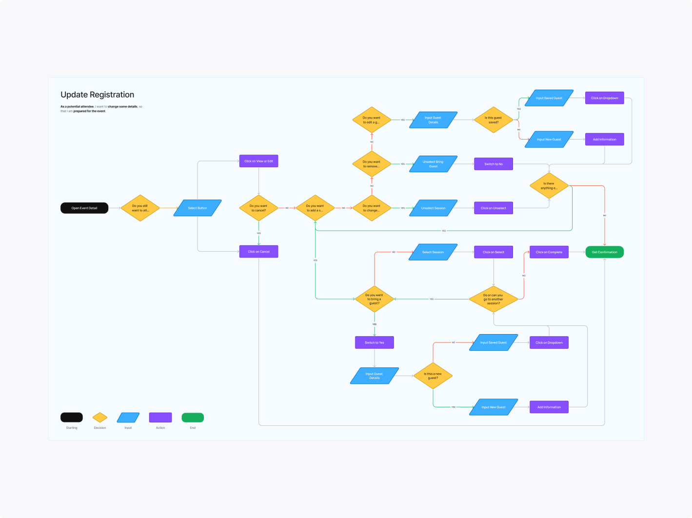
I mapped out various scenarios and use cases—from the initial Magiclink detail page to updating the registration. The goal was to make the experience intuitive, ensuring attendees could easily review details, finalize bookings, and be prepared for the event.

Final Designs
To resolve the issue of overwhelming details, I designed an interface that prioritizes the most relevant information. By balancing simplicity and functionality, I catered to both casual and avid attendees. This design ensures users can digest data at a glance and customize their experience to suit their needs.