Enhancing the airports tracker for the power user
Zongyuan Zoe Liu previously launched and found success releasing her interactive database for China’s overseas port ownership. Given the interest she built from people within military and commercial circles, she desired to deliver more with an interactive tracker of China’s investments in overseas airports. In this project, we were balancing feature enhancement and maintaining the customer loyalty already built.
Timeline
5 months
Team
1 PM, 1 jr designer, 1 engineer, 2 stakeholders
Role
Lead Designer
Methods
Survey, User Interviews, Focus Group, User Journey Map, Visual Design
-
Business: Make their dataset accessible
User: Would rather manipulate CSV within Excel
Defining the problem: How might we help customers configure the dataset to their liking?
-
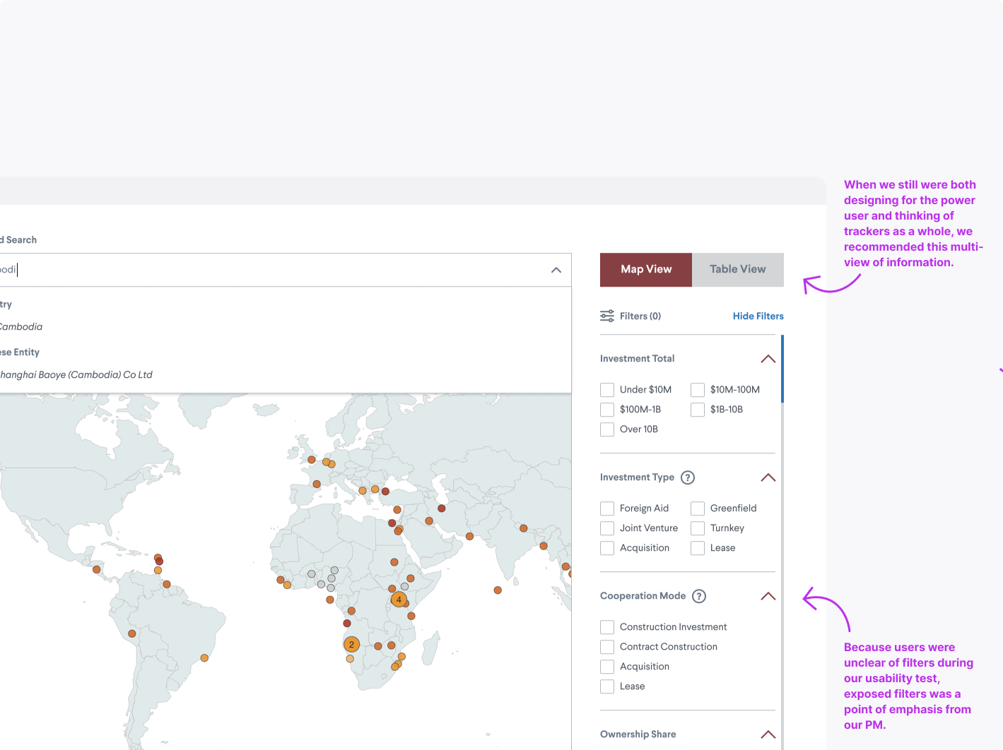
Enable filters to ignite that power user
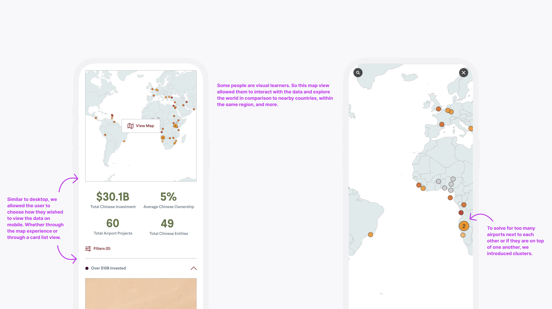
Optimize map view on mobile
Allow multiple views of the interactive to promote engagement
-
Decrease dataset download requests
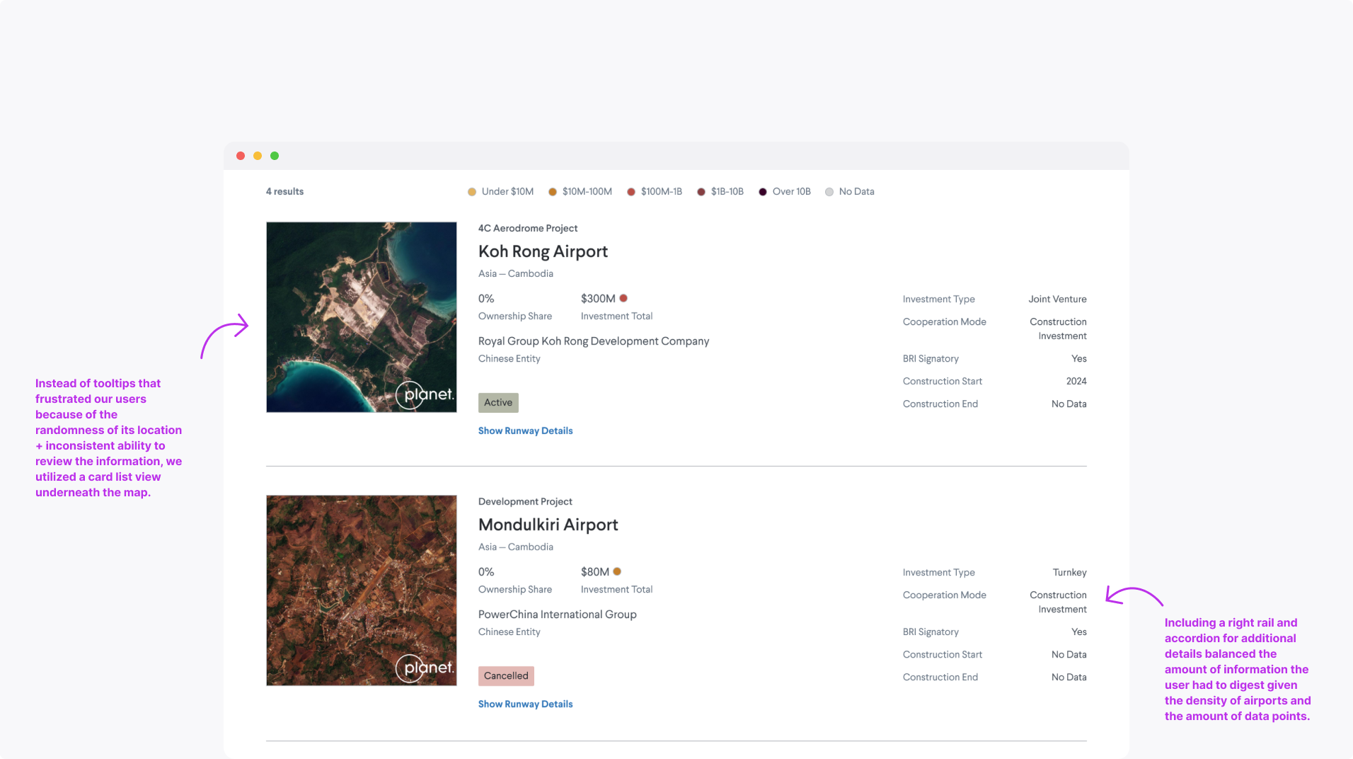
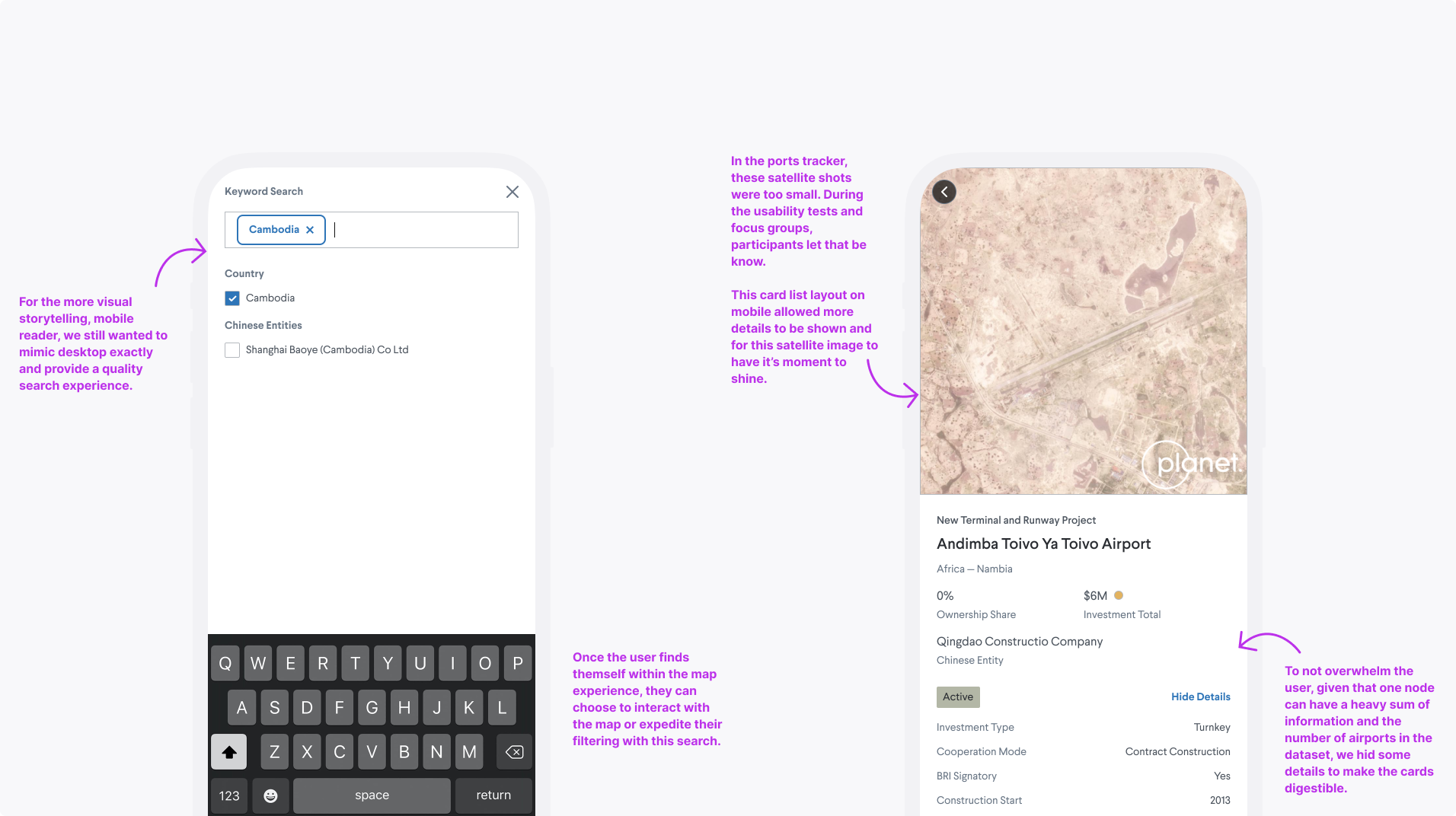
Our power users found the dataset to be of great use, but didn’t see the necessity or capability of manipulating the data on the pageImproved the design language to adapt to any screen size
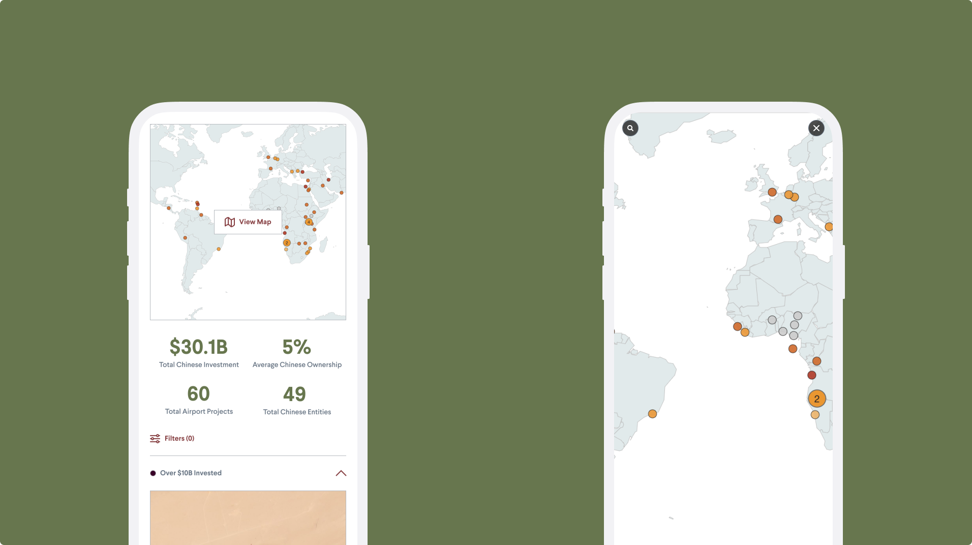
The ports tracker only allowed for the map experience on desktop, whereas on mobile, it was just a static imageIncrease time on page
The tracker lacked a reason to keep the user engaged outside of seeing how to get access to the CSV
-
Through our product manager's efforts, we conducted in-depth user research by partnering with a junior designer to run studies on the previous ports tracker to learn what their pain points are.
Why did you request the source data?
What is the most critical information you need to access?
What core functions do you need to have available?
Research Methods
Survey question flow chart posted for 2 weeks
Finalized list of questions we asked military fellows
Research Insights

Desktop vs mobile user
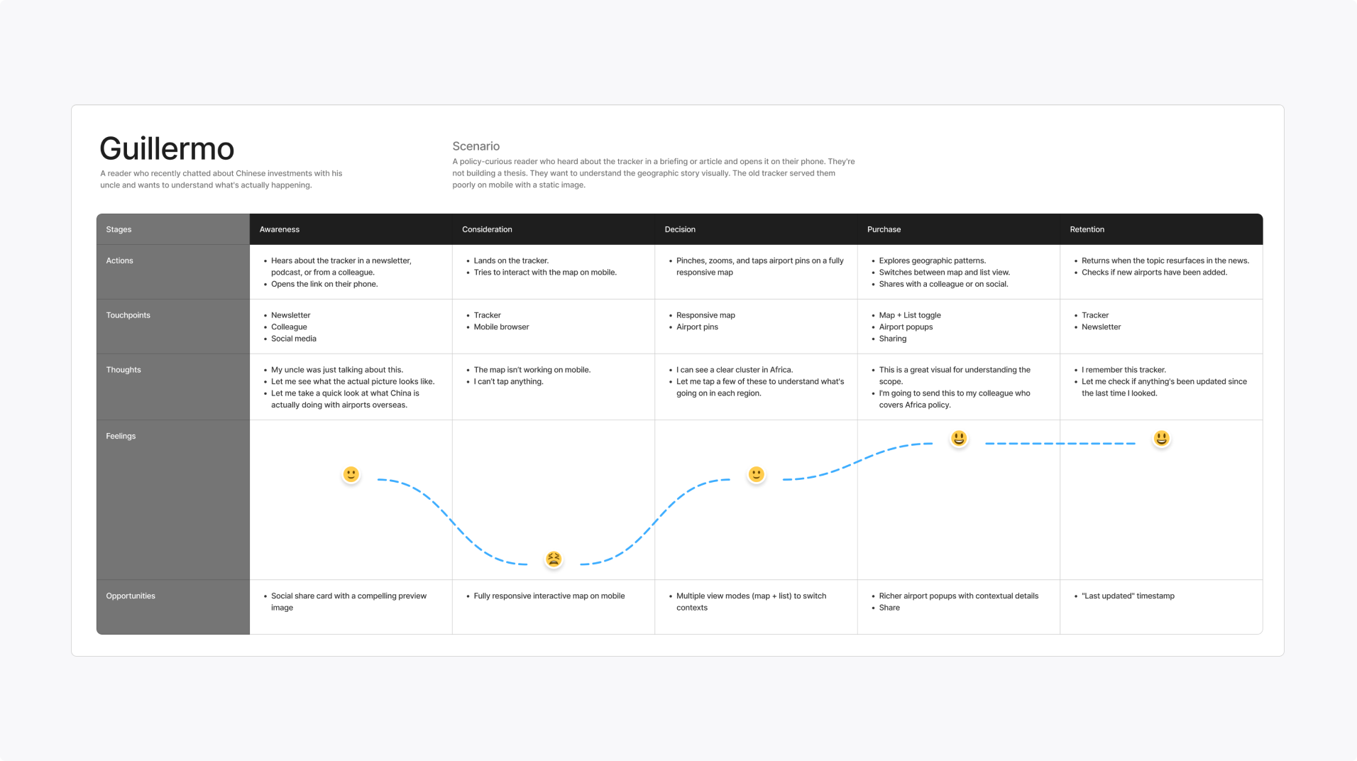
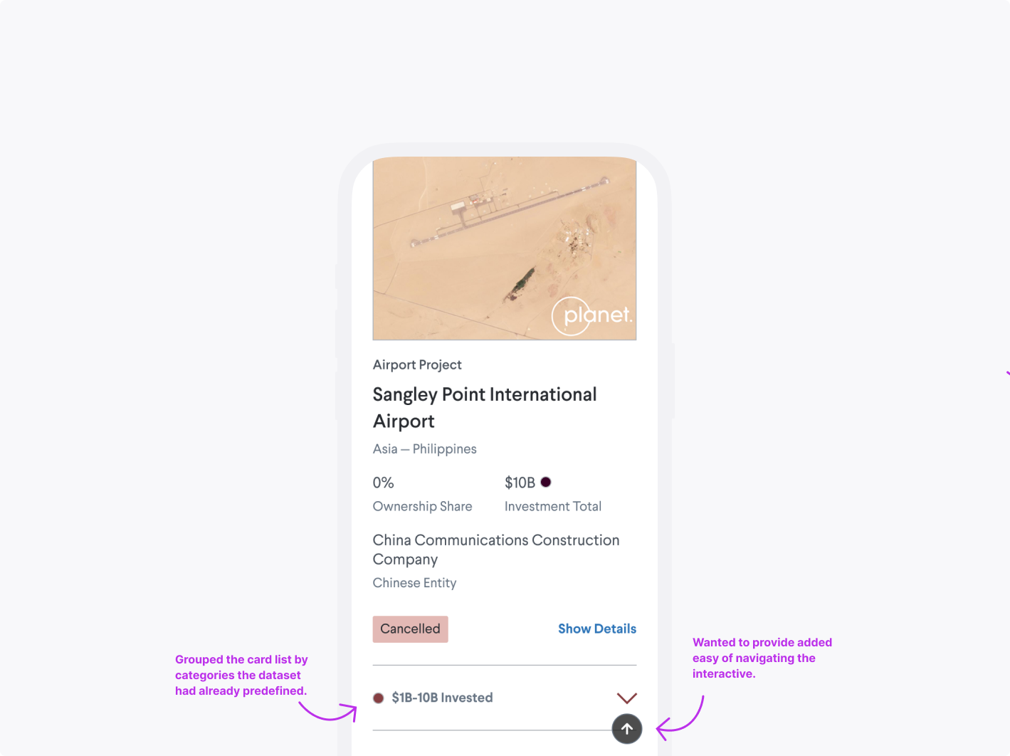
The map view is more for a casual reader looking for visual storytelling, and the table view is for an analyst who is building on a thesis
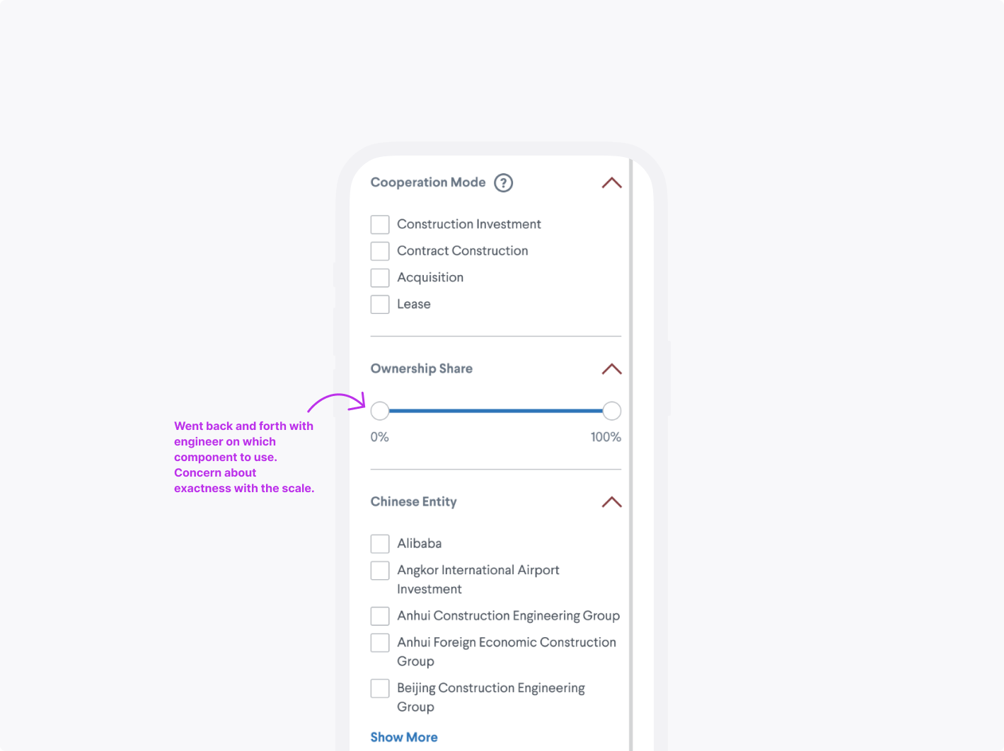
Desire to interpret data
Analysts want to be provided with features to slice the data in a variety of ways and potentially see trends
More details required
There’s insufficient information about the airport structure and staffing; however, what is around the airport matters just as much as the airports themselves
Final Designs
After concluding that we didn’t have the resources to design for the desktop power user, we had to shift our deliverables. This version of the product needed to better serve the casual users’ needs and motivations by meeting them where they were most comfortable: on mobile.

Takeaways
At some point, you may have to cut your losses and pivot.
Establish rapport with your engineers to understand the technical constraints and the realm of what’s technically feasible.